Wednesday 12 November 2014


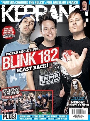
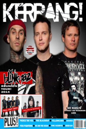
This is my version of the magazine cover I chose to remake. I started by creating the background and playing with the effects until I felt it looked similar. Next I used the magic wand tool to get the Kerrang logo for the title which I took from their page. This was put on a separate layer to the background. Once again I found an image of blink 182 that I felt suitable for a cover and I used the magic wand tool to cut them out and put them on their own individual layers so I could make them all an equal size in the right order. 
Once I had done this and played with the edges so they looked natural, I started creating the different coloured boxes that I'd need to place other images of text on. for my text to get a different effect I used the smudge tool to give it the Kerrang look.  There are several things I would change if I was to do the exercise such as the shapes, colouring and being spatially aware.

This was the magazine article I designed on indesign. First I had to make the background which was done by putting the colour I desired in a box covering the page. Then I had to find a subject to write on. I chose a subject I knew a great deal about which was a video game. I chose a picture to use as a secondary background so to speak. I stretched it out over the page until I felt it looked suitable. Once I did this I looked for the game logo as it was already on a black background this was an easy task to put into the layout of the double page spread.
Once I had the images in the correct positions I created the columns for the text to go. All I had left to do after this step was insert the text I wanted in the article. I found this a reasonably easy task with only very few problems along the way.
In order to make my retro film poster I chose one of my most recently watched films which was The Rocky Horror Picture Show. The first thing I did was to create a background in Adobe Photoshop CS6; once I had a suitable black background for my image that I had yet to choose I looked for the film logo on Google Once I found the logo on a film cover I removed it from the image it was already on with the magic wand tool and placed it over my black background in a new layer. This is how I had the base for my film cover.
Once I had this I knew I had to find an image which explained a little bit about the film and/or the characters personalities. Upon finding this image I placed it on a layer and followed the same procedure as last time by removing the background that was already there. As the characters hair was quite messy it was difficult to make it look good by just using the magic wand tool so once I had done this I played about with the edges until I had an image that didn't look completely out of place on the black background.
 After finishing with the edges I decided in order to make my image look ‘retro’ I needed to edit the levels, brightness and contrast of the poster until it seemed like it had aged.  Another technique I put to practise was to use the wax effect which would once again make the poster seem older. Once all this had been done I felt it needed the credits of the film to make it look official so I typed them out in my own style on a new layer. Once all this had been done I merged every layer down and it became a solid image. I'm proud of this image as I feel it looked good compared to the other posters I found on this film.
1ScreenHunter_606_Oct_07_15_38
This is my Pop Art Poster I made for my Digital Graphic assignment. The first thing I did was pick a Landscape A4 page to work on. Once I had this I chose my picture of a famous person, in this case I used Evan Peters as his Character in American horror story. I chose this character because he has blonde hair which makes the hair look more defined in the following steps.
I then scaled the image over the A4 page and turned it into greyscale but without flattening the image. Once this step was completed I duplicated the layer with my picture labelling both layers either hair or face. Then I went onto the Levels of the layer and adjusted them to give definition to either the face or the hair and/or background; this depends on how many layers and how detailed you want the final image to be. Once I had all the layers I needed to have definition, I then had to deleted the hair while on the face layer and the face while on the hair layer so both could be visible at the same time. 
After, I made a brand new layer and named it 'Background'; following this I changed the mode to RGB colour. I coloured it in with my chosen colour which was red. Then I clicked multiply which gave the picture a single block colour. I then repeated this for every layer and every part I wanted in a different colour making sure to rub out the excess colour I didn't want e.g., I didn't want the red over him so I used the eraser tool to get rid of it. Once I had all the colour I wanted I had finished the image and flattened it so it became a proper JPEG image.